Creating a color-coded map of pressure and velocity
Color code various attribute values to view simulation results in the map display.
Tutorial resources
These downloadable resources will be used to complete this tutorial:
Creating a color-coded map of pressure and velocity
Step-by-step guide
To help visualize steady state simulation results, create a color-coded thematic map based on attribute values. In this example, create a map of the pressure and velocity results.
- To open ArcGIS Pro, double-click the desired project .aprx file.
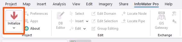
- Click the InfoWater Pro tab.
- In the Project panel, click Initialize.
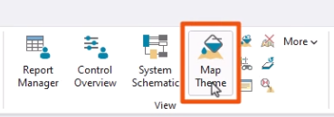
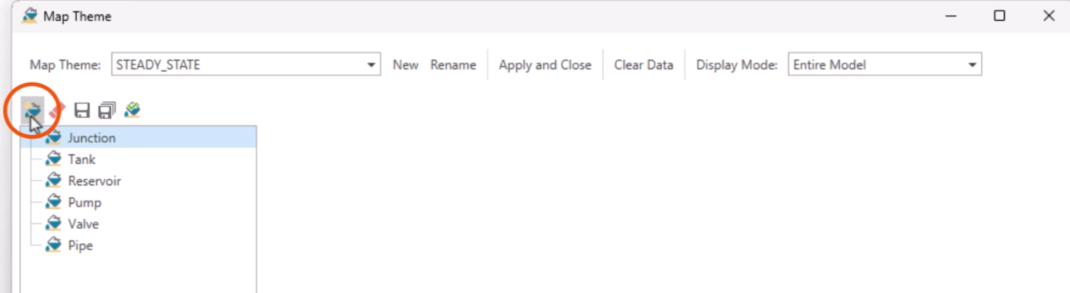
- On the ribbon, in the View panel, click Map Theme.
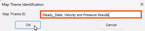
- In the Map Theme Identification popup, give the theme a name, such as “Steady_State, Velocity and Pressure Results”.
- Click OK.
In the Map Theme dialog box, configure the map theme to display the needed information.
- Select Junction from the element type list.
- Click New to create a new junction sub-theme.
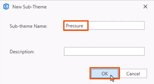
- In the New Sub-Theme dialog, give the sub-theme a name, such as “Pressure”.
- Click OK.
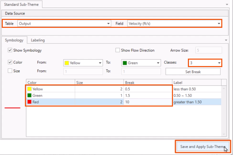
- In the Standard Sub-Theme window, Data Source group, set the Table drop-down to Output.
- Set the Field drop-down to Pressure (psi).
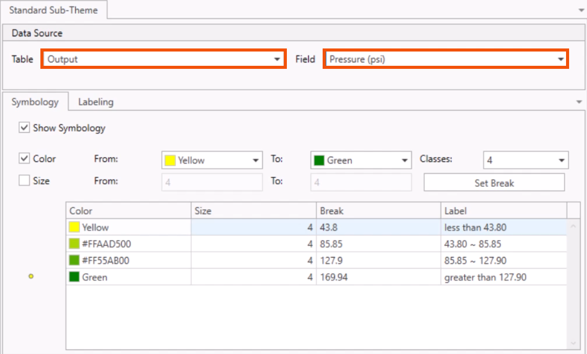
- On the Symbology tab, set Classes to 4.
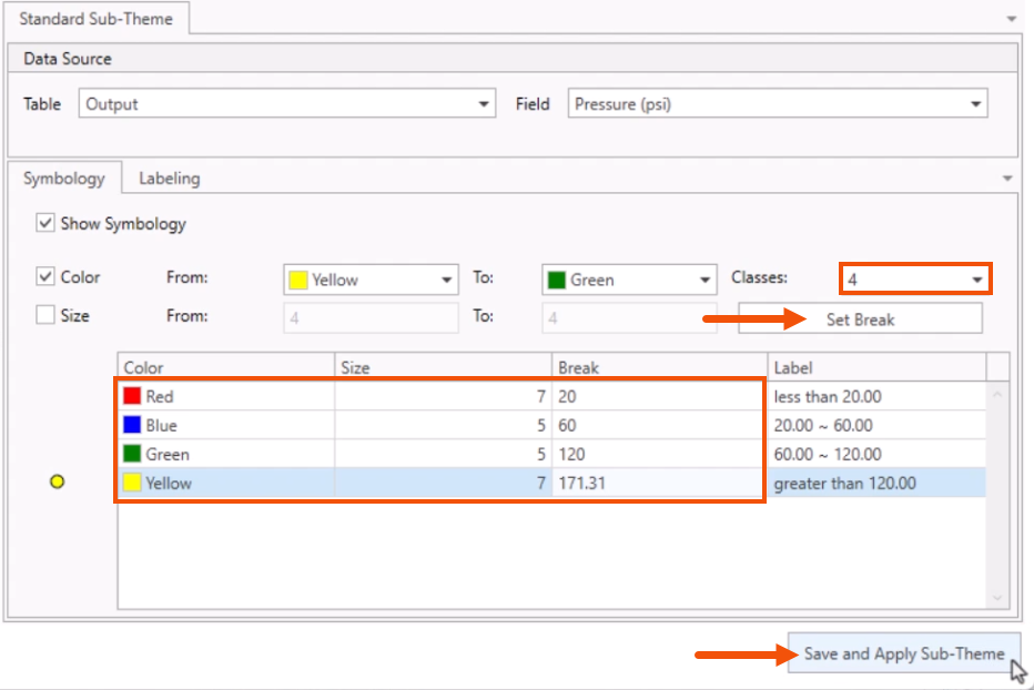
- Click Set Break.
- In the table, change the settings as follows:
- Row 1: Color Red, Size 7, Break 20.
- Row 2: Color Blue, Size 5, Break 60.
- Row 3: Color Green, Size 5, Break 120.
- Row 4: Color Yellow, Size 7, Break 171.31.
- Click Save and Apply Sub-Theme.
Now, create a new pipe sub-theme.
- Select Pipe for the element type.
- Click New.
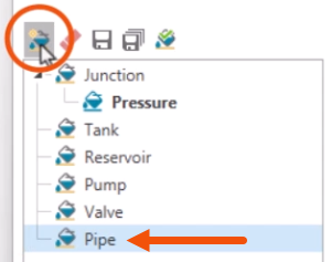
- In the New Sub-Theme dialog, give the sub-theme a name, such as “Velocity”.
- Click OK.
- Set the Table to Output, Field to Velocity (ft/s), and Classes to 3.
- Click Set Break.
- In the table, change the settings as follows:
- Row 1: Color Yellow, Size 2, Break 0.5.
- Row 2: Color Green, Size 1, Break 1.5.
- Row 3: Color Red, Size 2, Break 10.
- Click Save and Apply Sub-Theme.
- Close the Map Theme dialog.
- Zoom to the extents of the model.
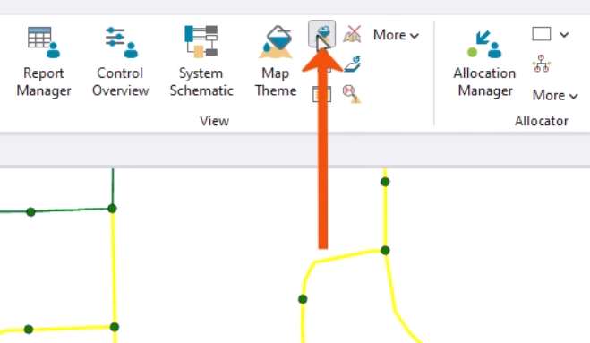
The map shows the pressure and velocity displayed by these color-coded ranges.
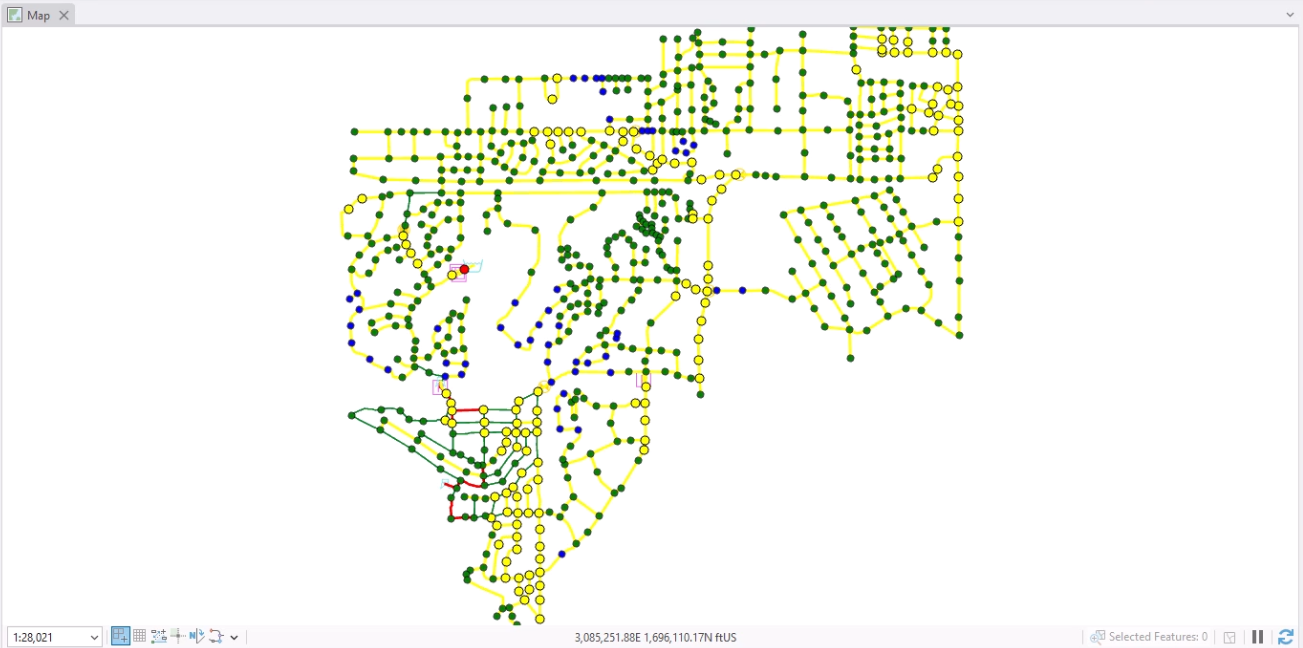
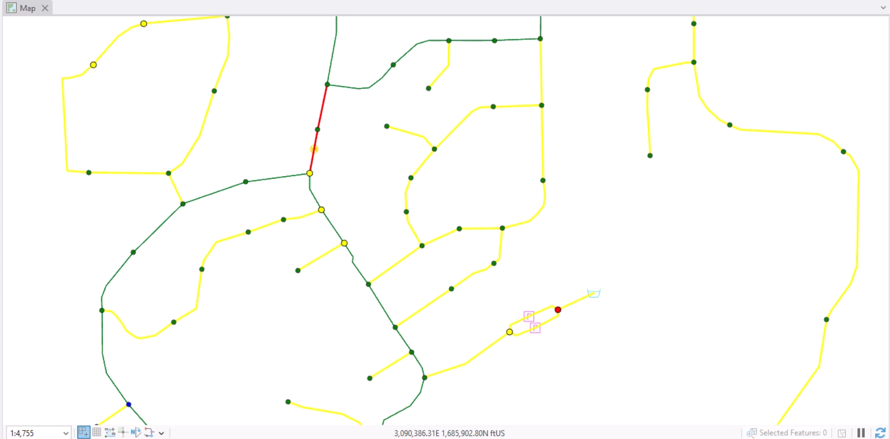
- Zoom into any areas that may require further review.
Realize that because this is based on a steady state analysis, this is just a snapshot in time for this system. It is also possible to create a thematic map based on a time varying output.
To reset the display to the default, as set in the Preferences:
- On the ribbon, View panel, click Reset Map Theme.